ART-VOLGA Lukashuk N.
ART-VOLGA Gallery - All Artworks by Lukashuk N.
ART-VOLGA Gallery - the only online gallery representing the artists of Povolzhskiy region of Russia worldwide.
Using the unlimited opportunities which Internet provides in the way of distributing the information, we give the Russian artists living away from the well-known cultural centers an excellent opportunity to become popular not only locally, but worldwide, by presenting their artworks in our gallery. It is the perfect opportunity for them to get new orders and clients, start new creative contacts and find new admirers. The main task of ART-VOLGA Gallery is to help the artists to sale the artworks presented in our online gallery.
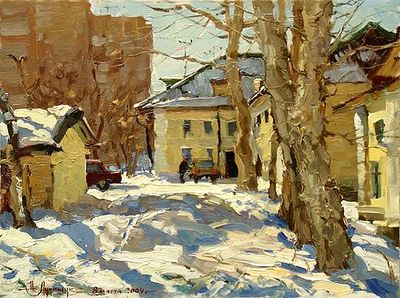
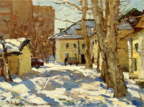
Yellow House
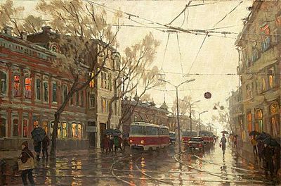
City scape
ART-VOLGA Gallery - the only online gallery representing the artists of Povolzhskiy region of Russia worldwide.
Using the unlimited opportunities which Internet provides in the way of distributing the information, we give the Russian artists living away from the well-known cultural centers an excellent opportunity to become popular not only locally, but worldwide, by presenting their artworks in our gallery. It is the perfect opportunity for them to get new orders and clients, start new creative contacts and find new admirers. The main task of ART-VOLGA Gallery is to help the artists to sale the artworks presented in our online gallery.
Yellow House
City scape

posted by Unknown at 5/09/2005 01:34:00 pm
0 comments
![]()
![]()